Client

Occunet • Fairos

Type

UX Design • UI Design • Visual Design • Design Systems

Year

2024

Occunet is a healthcare insurance company with a network of members who user their portal to

1. Submit “balance bills” which will be negotiated for fair reimbursement
2. Find healthcare providers based on specialty, location, and whether they are in their network

My Role

My role on this project was as Product Design Lead and my main focus was improving the design and usability of the new Occunet Portal. This included:

  • Disseminating and integrating client side user research
  • Information Architecture | App Structure
  • Wireframing
  • UI Design and Prototyping | Mobile + Desktop
  • Cross Functional Collaboration | Discovery, wireframe and design review meetings with internal and stakeholders

Team | Internal

  • Product Design Lead (me)
  • Senior UI Designer
  • Product Owner
  • CTO

Team | External

  • Engineering Lead
  • Front End Developer
  • QA Engineer
  • Back End Developer
  • Project Manager

Outcomes

Through a full redesign of the desktop and mobile app, 2 major outcomes were accomplished that aligned with both user needs and business objectives

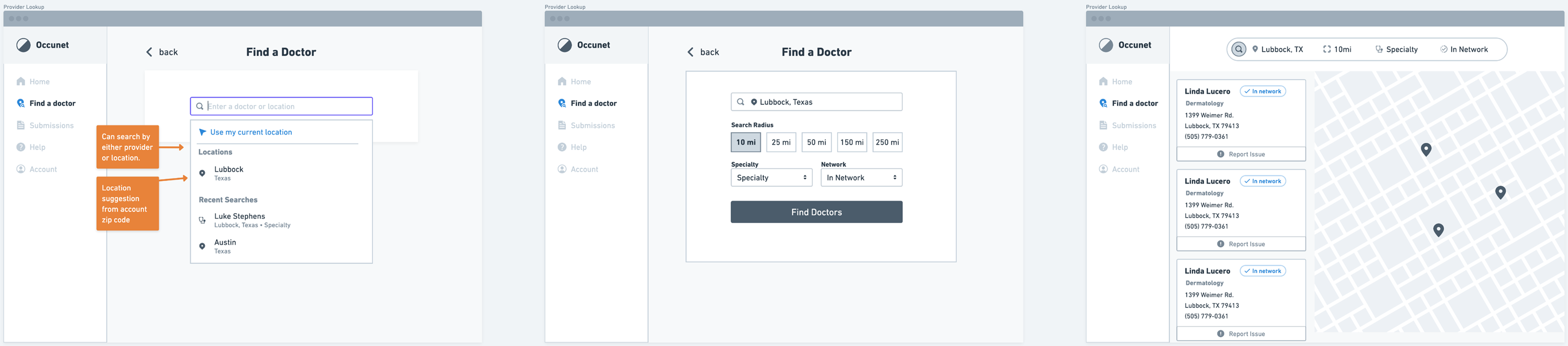
The new search has resulted in 32% less searches without results and 48% more searches that result in a click. Members are able to find in-network providers quickly, and without worry or confusion over coverage.
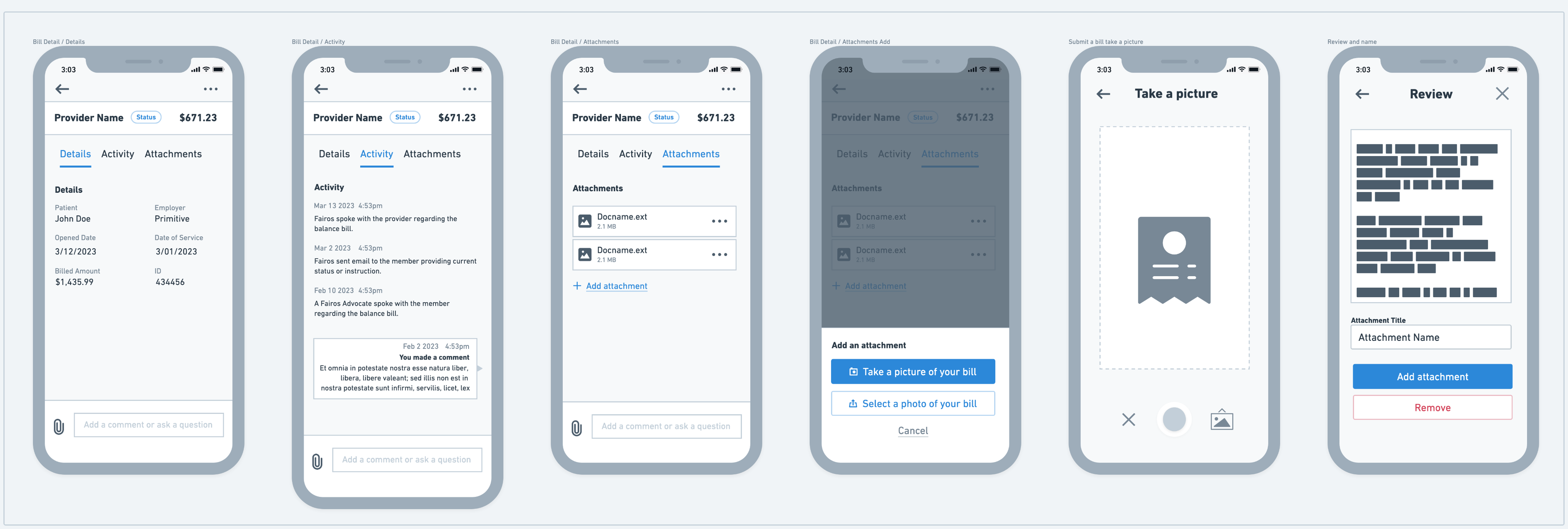
Members are able to upload balance bills directly from their phone. This new process benefits both members by being able to manage their bill directly, quickly, and with added communication channels such as messages and notifications. This process benefits the business by reducing support and operational costs in contrast to how balance bills were handled previously.

The Problem

Current Portal - User Insights

What do our users think of the current portal?

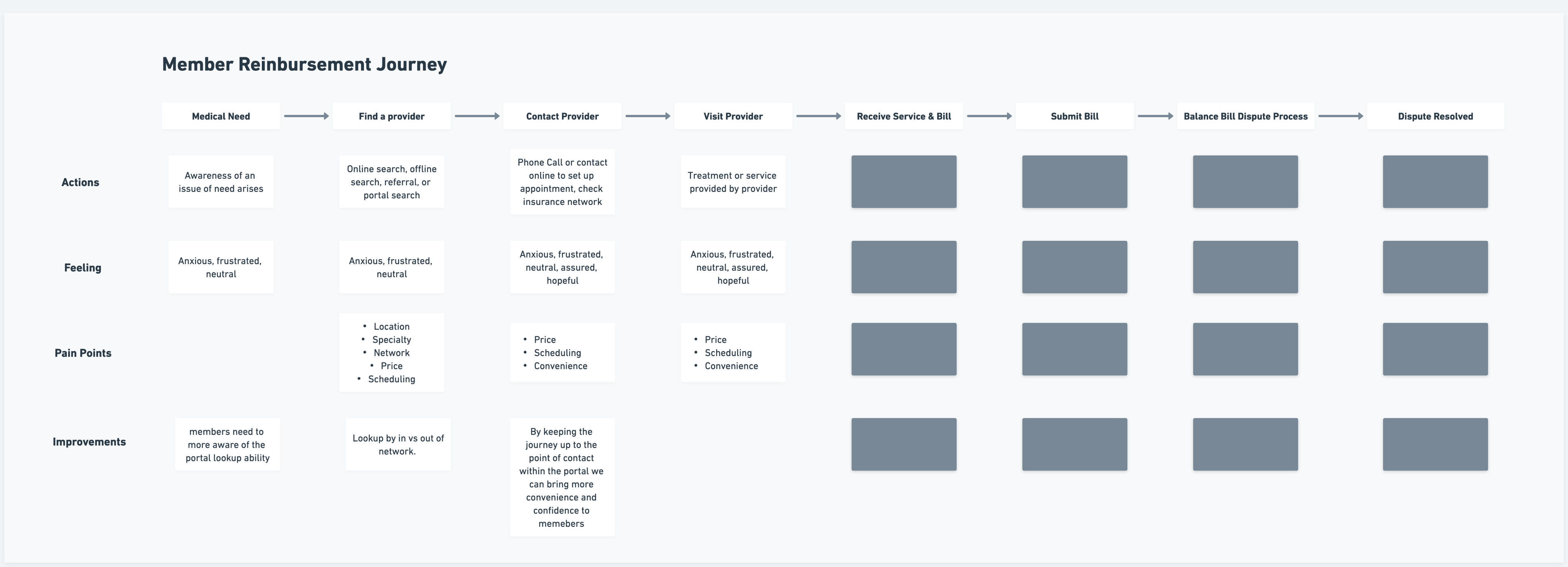
For this project, Fairos conducted their own research (Surveys, Interviews, Analytics) that gave us some early insights on issues to address.

User Preferences

  1. Members are mostly middle-aged to older, with a minority of younger users.
  2. Members want an easy way to find providers within their network, without surprises.
  3. Members coming from a place of slight irritation/frustration.
  4. Users want to be able to use their phone for the entire process.

User Feedback

  1. Members are searching outside of the portal for the provider lookup, leading to business challenges.
  2. Within the portal, members struggle to find what they are looking for. Search analytics show >20% of searches yield no results.
  3. Users struggle to find providers that are in their network with confidence.
  4. Search experience is fractured and clunky.

Problems to Address:

1. Search is currently an arduous task. Many searches result in no clicks with users reporting useless results.
2. Search is currently confusing with too many interwoven factors.
3. There is currently no way to “browse” providers.
4. No way to search for providers in network, or any clear indicators on in vs out of network.

Process

Our Objectives

Through a collaborative ideation process involving myself, product, and another designer, an approach of outcomes and solutions were identified and proposed to stakeholders. Our main goal was to keep the provider search journey inside the portal up to the point of provider contact, and Offers more usable search experience that results in less searches without results and more searches that result in a click.

Simplify the search bar
Support ongoing search and refinement
Add a browsing ability
Add in-network searching + indicators
Improve the overall design and flow by utilizing best practices

User Journey + Flows

The first few steps in the process was to define the user journey and to map out some low fidelity flows. These assets were used to collaborate effectively with external stakeholders to align around clear visuals.
Provider Search Flow

Wireframes

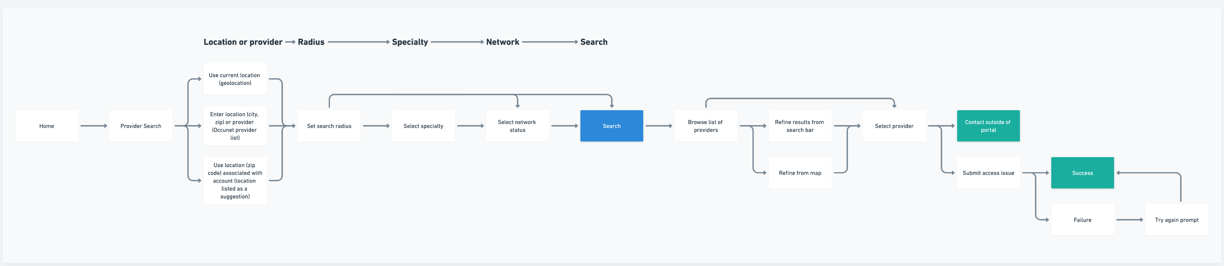
Following aligning internally and externally around our flows, we moved on utilizing wirefaming to map out the new experience. This phase held the most collaboration as we used this time to truly align visually, determine feasibility, and iterate accordingly.

Example wireframe screens mapping new search
Mobile Provider Search Wireframes
Balance Bill Wireframes

UI Design

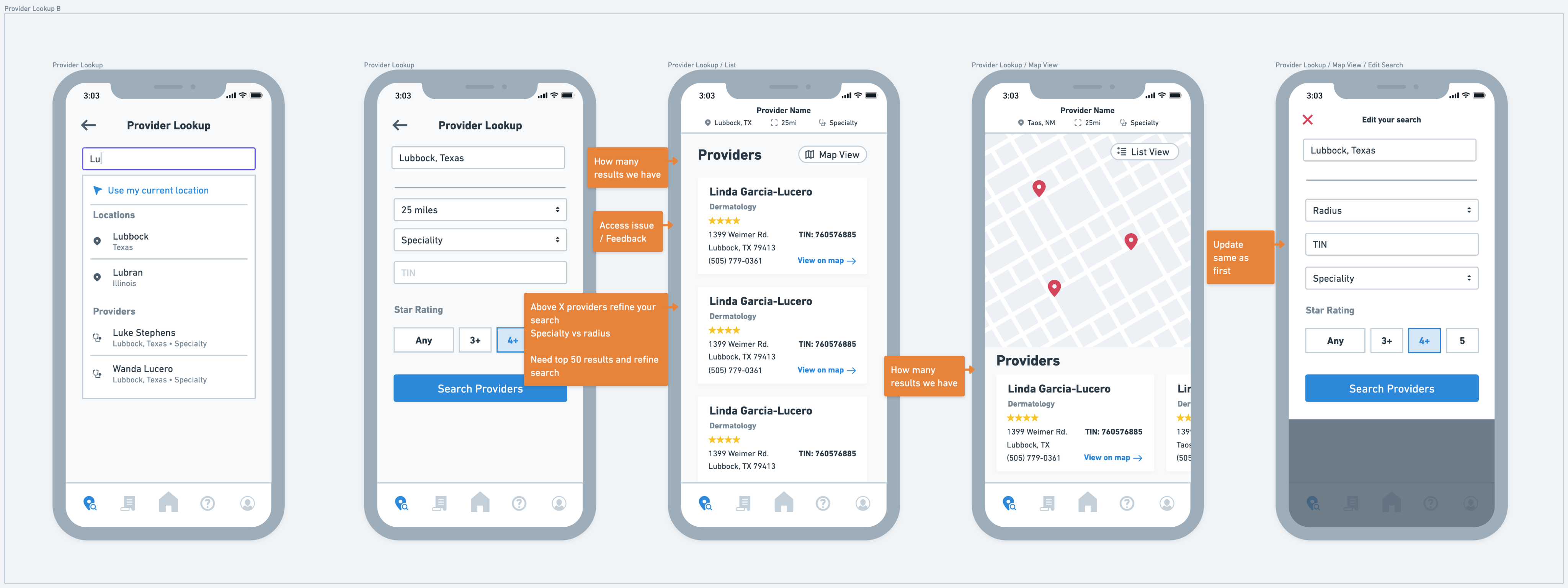
In this phase, we were able to take our business objectives, user needs, and proposed solutions contained within the wireframes and bring them to a higher fidelity, ultimately ending with a clickable prototype delivery. We used Figma as the primary tool for the UI design + prototype.

Final Prototype

Design System

A design system and style guide was developed and maintained by our team in order to increase alignment with external teams and to keep the design consistent and effecient as it scaled. The design system documented:

  • Colors
  • Typography
  • Inputs
  • Tags
  • Components + States
  • Toasts
  • Cards
  • Layout
  • Tabs
  • Buttons

Want to hear about this project in more detail?

See more of my work