.png)
.png)
User Research
Journey Mapping
Sketching
Wireframing
Screen Flows
Visual Design
Interaction Design
Product Designer (me)
Senior UI Designer
Product Owner
Dev Lead
CTO
Engineering Lead
Front End Developer
QA Engineer
Back End Developer
Project Manager
CTO
Through discovery, research, and design, I led the end-to-end design of the Occunet member portal. At launch, the new experience achieved business objectives and supported user needs.
improvement in search conversion
improvement in zero-result searches
.png)
OccuNet is a healthcare cost-containment company that helps companies and health plan members save money on medical bills by negotiating prices with providers and managing out-of-network claims.
Occunet aims to use their own technology to make healthcare costs more transparent and easier to control.
• Allow members to find providers, view claims, and manage bills without calling support
• Reduce administrative overhead and support demand
• Address consistent member support frusrations in finding providers
• Increase member control and transparency in bill management
• Help members easily find in-network providers to avoid expensive out-of-network bills
• Lower overall claims and negotiation volume by offering self service
What makes finding in network providers frustrating?
Members lack a clear and reliable way to find in-network providers leading to frustrations. As a result, unnecessary time is spent verifying providers, often leading to surprise bills and loss of trust in their health plan.
Users have to jump between insurer sites, provider pages, and third-party tools to confirm coverage. It’s not always obvious whether a specific provider, location, or specialist is actually in-network for their exact plan and search tools often can give inconsistent or too broad of results.
As part of understanding residents’ broader renting experience, I surveyed people with experience using a resident portal to learn how often they access their resident portal, what device they use (desktop or mobile), and which features they find most or least useful.
I also focused specifically on the service request process to identify what aspects residents value most, what causes frustration, and what features they expect to make maintenance requests faster, clearer, and easier to manage.
This research was conducted in order to inform and validate the features, and to inform where to focus our design and development efforts in order to make the most impact for the resident.
Baseline review of the existing search tool’s performance and identification of metics to improve. This review was limited, due to limited functionality of the existing tool, but yielded interesting insights around searches that result in a click and the user journey.
Going through the support ticket forms pointed directly to where frustrations were for members. Occunet also had a large number of member feedback surveys they would sent out both on a schedule, and following the resolution of a balance bill.
.png)
Members lack a clear and reliable way to find in-network providers leading to frustrations. As a result, unnecessary time is spent verifying providers, often leading to surprise bills and loss of trust in their health plan.
How do the insights from discovery and research translate into the design and approach?
Users have to jump between insurer sites, provider pages, and third-party tools to confirm coverage.
It’s not always obvious whether a specific provider, location, or specialist is actually in-network for their exact plan.
Filters and search results can be inconsistent or too broad, forcing users to sift through irrelevant options.
Users expect to see all options in one place, in-network vs. out-of-network clearly, and to search based on those parameters.
Search should be supplemented with browsing to support users who know what they're looking for and those who don't.
Users expect a similar experience to Google Maps or Yelp in terms of filtering, mapping, and viewing providers.
Drawing from our discovery and research, I mapped the customer journey to visualize key moments across the experience. This process revealed pain points and opportunities for improvement within the app.
The journey map also became a collaborative tool helping align all teams, as this was a collaborative process where we would discuss, iterate, and align on live sessions together.

Builds shared understanding of the user experience across functions (design, product, engineering, etc.)
Reveals pain points, gaps, and opportunities that might not be visible from siloed perspectives
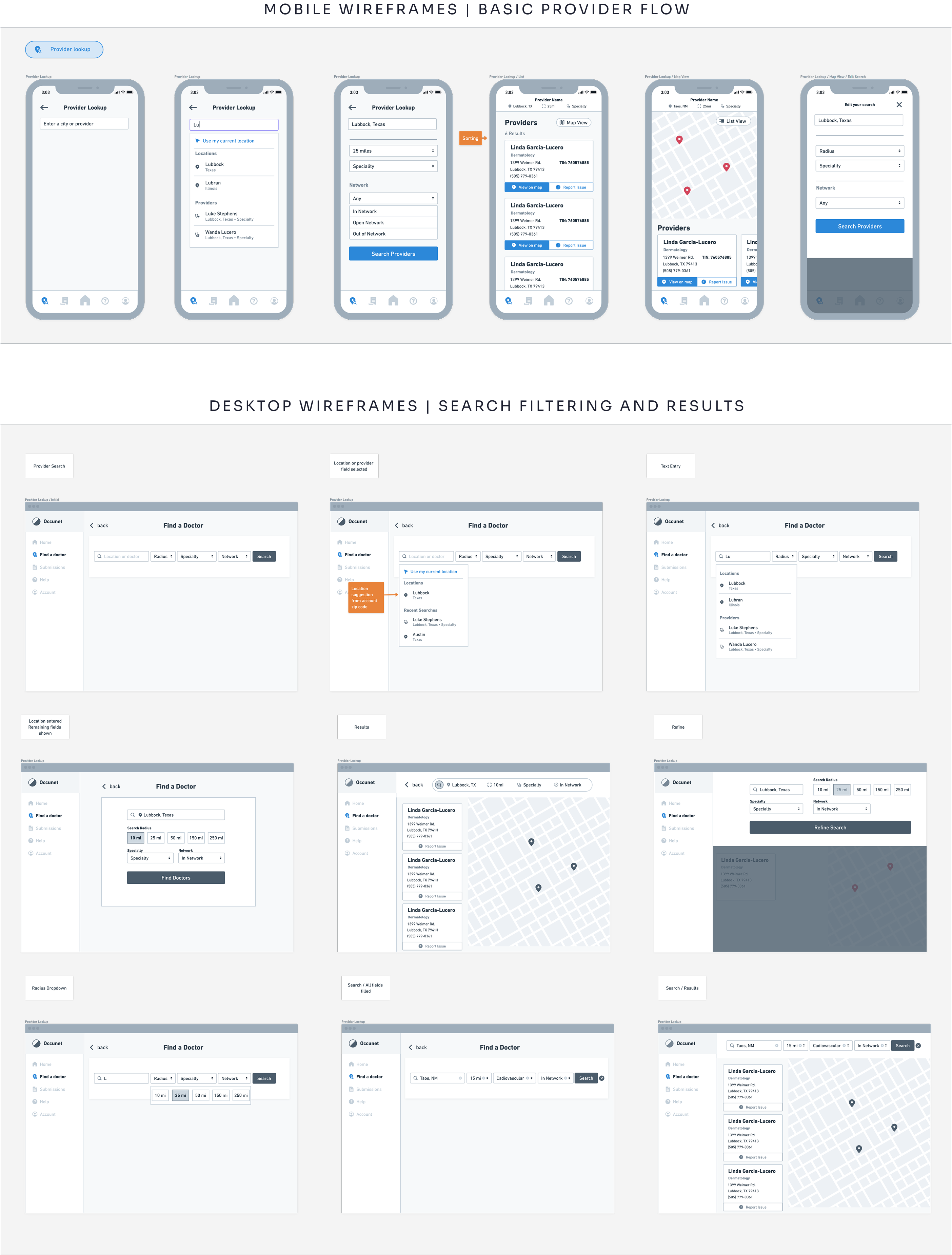
I explored a wide range of concepts with the product team, sketching and iterating on ideas through low-fidelity wireframes and prototypes. This process helped us quickly test possibilities and identify clear design directions to move forward with.
The wireframing stage served as another crucial point of collaboration, where stakeholders across product, dev, leadership, and design all collaborated visually as I presented the wireframes. Collaboration was both asynchronous and synchronous and served to bring important perspectives into the loop early in the process.

Here the goal was to ensure key functions are accounted for and to catch misalignments early, before development begins. We also wanted to identify potential uability issues and gaps for the same reasons.
The wireframes served as the first opportunity to get a clear visual idea of the member portal. With close involvement from leadership and other stakeholders, we wanted to ensure collaboration, iteration, and approval.
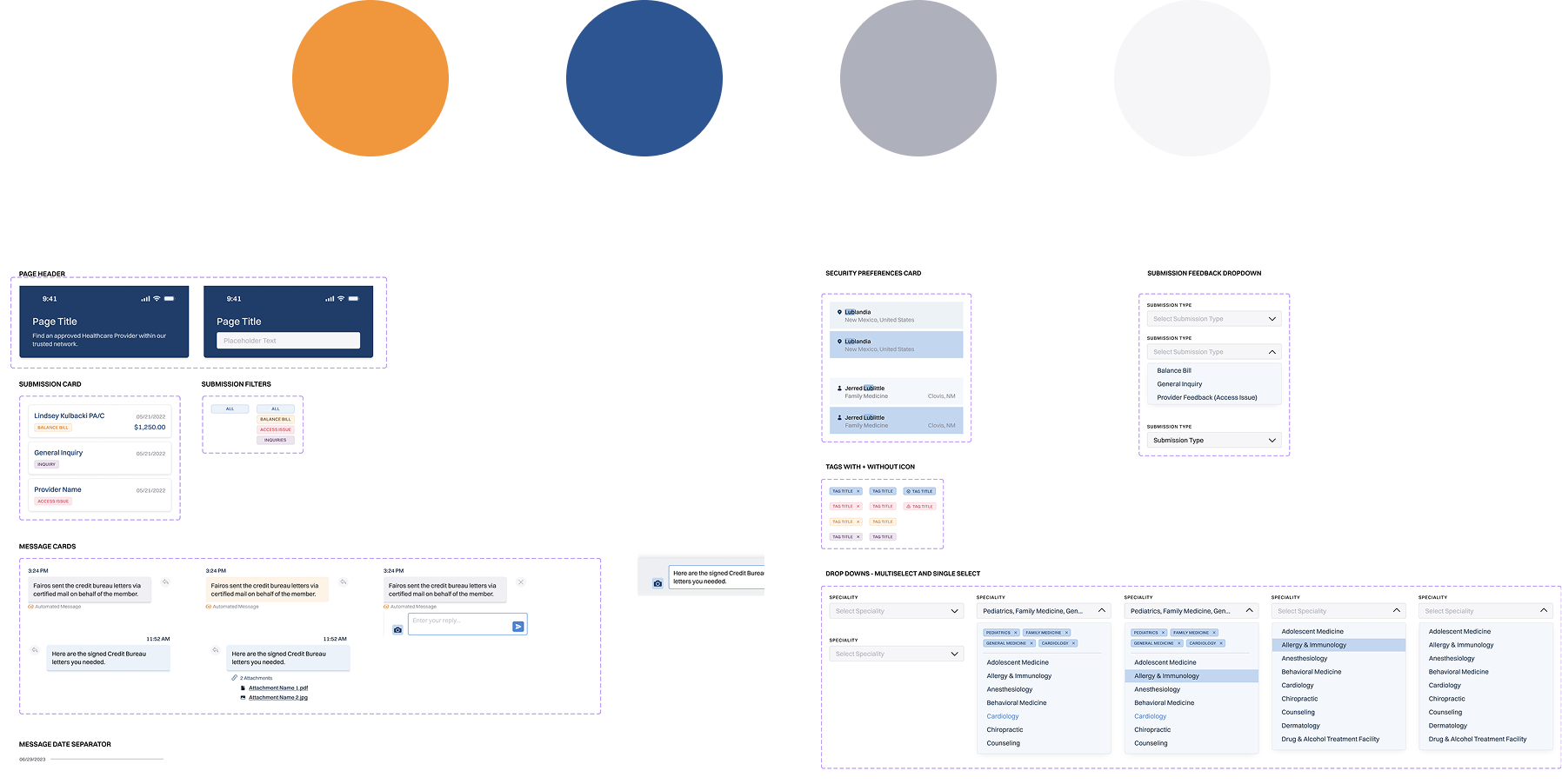
The UI design process was a collaboration primarily between myself and a visual designer. The Occunet member portal was designed prioritizing scalability, responsiveness across devices, and to effectively represents the Occunet Brand.
Priority was focusing accessibility and usability keeping our diverse users needs in mind. This means high contrast, larger type, and simple elements.
Clear indicators when it comes to providers, balance bill status, in-network status, is one of our primary design goals, so a thought out color system was key.
.png)
.png)
The prototyping process involved building out a high-fidelity clickable prototype to clearly represent core functionality and interactions.

Searches in the app saw a steep decline in the amount of searches that did not result in an action. This is largely due to offering search refinement suggestions when searches yield no results.
Searches that yielded no results were also improved. This is largely due to expanded user control through filtering, and an updated provider database.
Support usually meant Occunet on the phone helping members through the problem. Balance bill and provider search support needs were reduced by allowing for self-service of these common issues.
Members are now empowered to upload, manage, and track their balance bills without having to call support. They can also find in-network providers themselves.
Members now have better idea of what providers are in-network, and where their balance bills stand in the process.
Members can search, make appointments, and undergo procedures with peace of mind knowing whether or not providers are in-network.

