.png)
User Research
Journey Mapping
Sketching
Wireframing
Screen Flows
Visual Design
Interaction Design
Product Design Lead (me)
Senior UI Designer
Product Owner
Dev Lead
CTO
Engineering Lead
Front End Developer
QA Engineer
Back End Developer
Project Manager
CTO
building an impactful brand identity
and website for the fundraising arm
of Texas Tech Athletics
The college athletics space is changing quickly, and so is Red Raider Club. The organization seeks to define a new brand identity moving into a rapidly evolving environment that they know very well.
They want to capture attention, motivate existing and potential donors, educate, and ultimately drive donations that make an impact for student-atheletes.

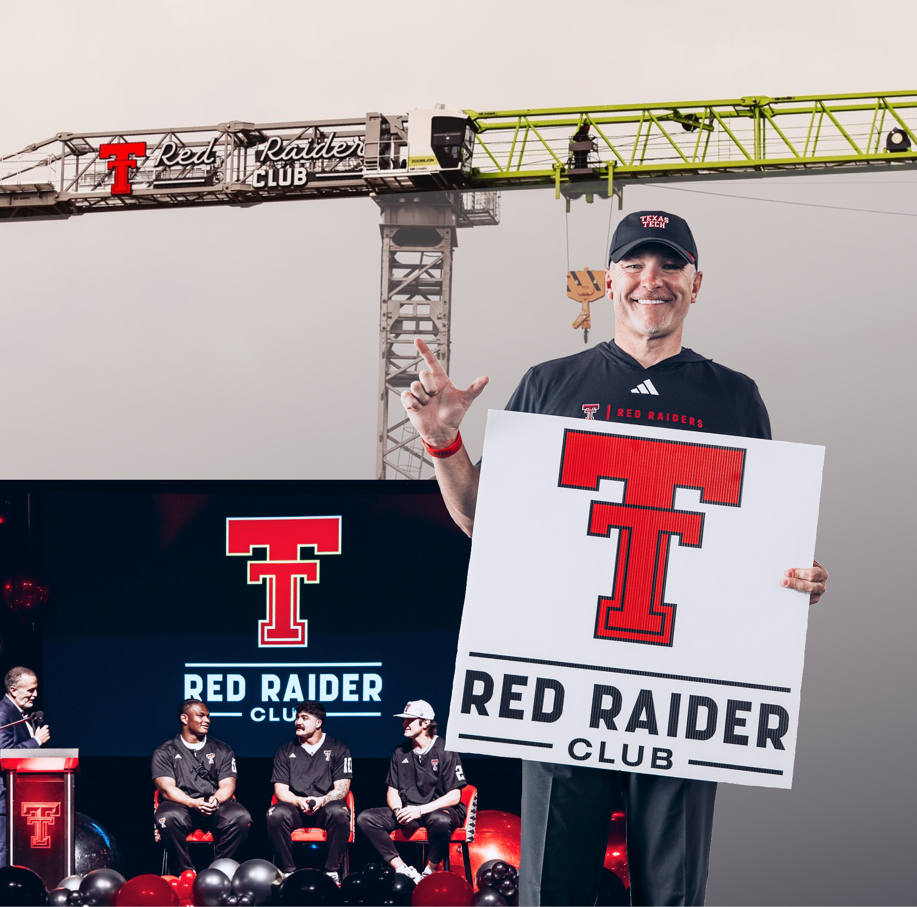
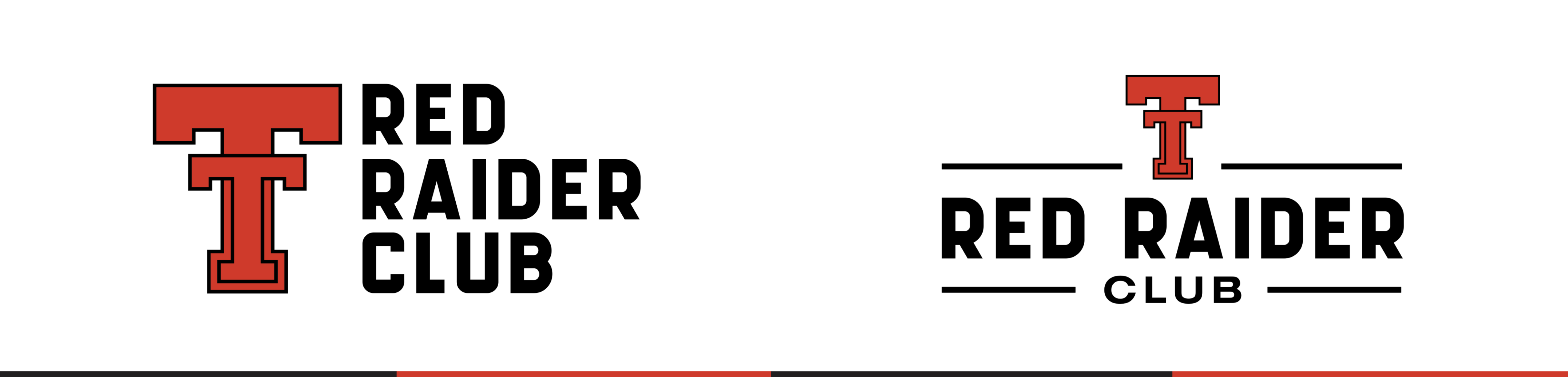
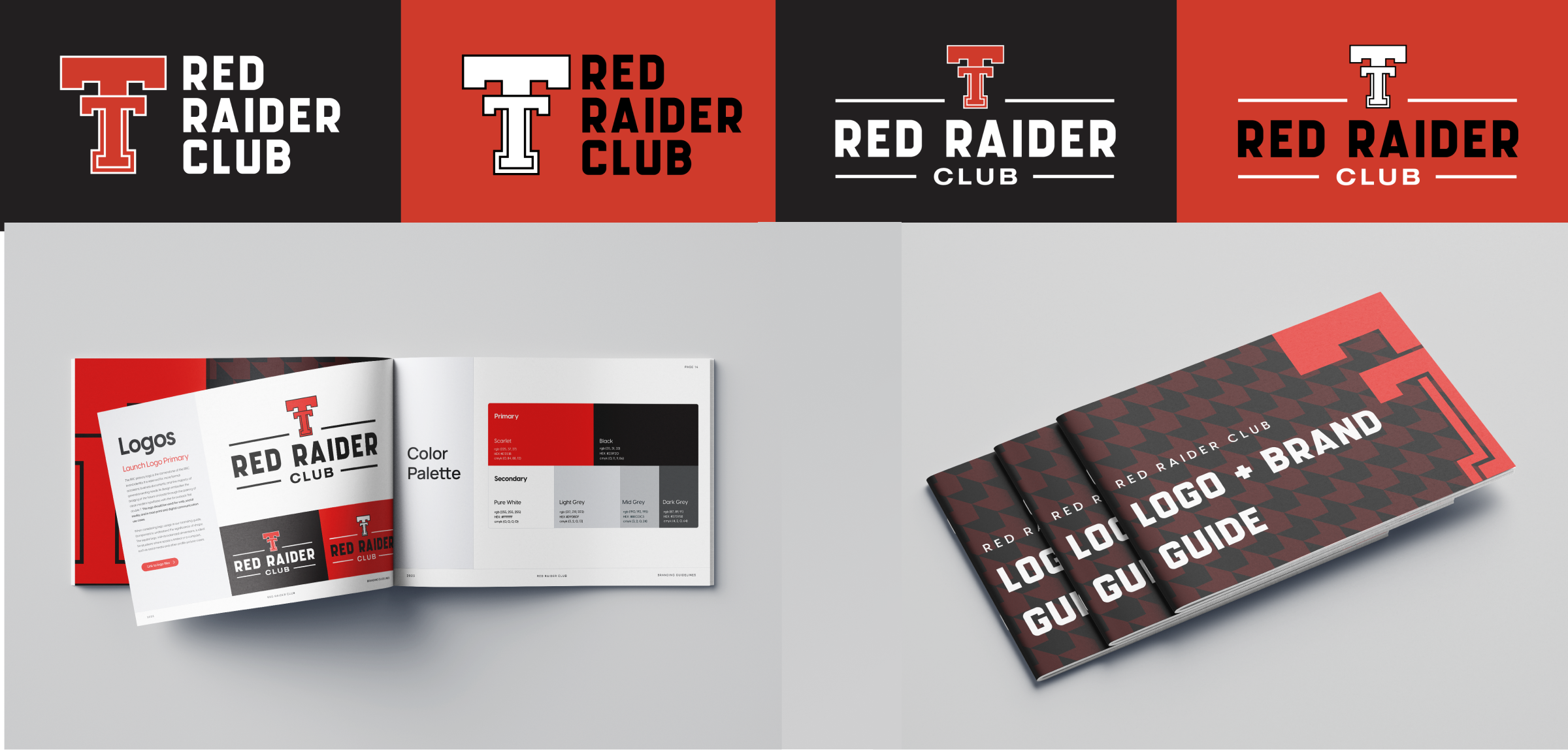
The updated logo takes a simple, timeless approach, refined and rooted in tradition. The flat Double T and clean typography create a look that’s confident, modern, and versatile.
It honors the Red Raider Club’s legacy while staying adaptable across merchandise, fundraising, and digital platforms.
The logo system was designed with flexibility at its core. A full suite of variations, horizontal, stacked, icon-only, and text-focused were created to ensure the brand could adapt across mediums and use cases.
Whether it’s used on merchandise, digital platforms, signage, or donor materials, each version maintains consistency while giving the Red Raider Club freedom of use.

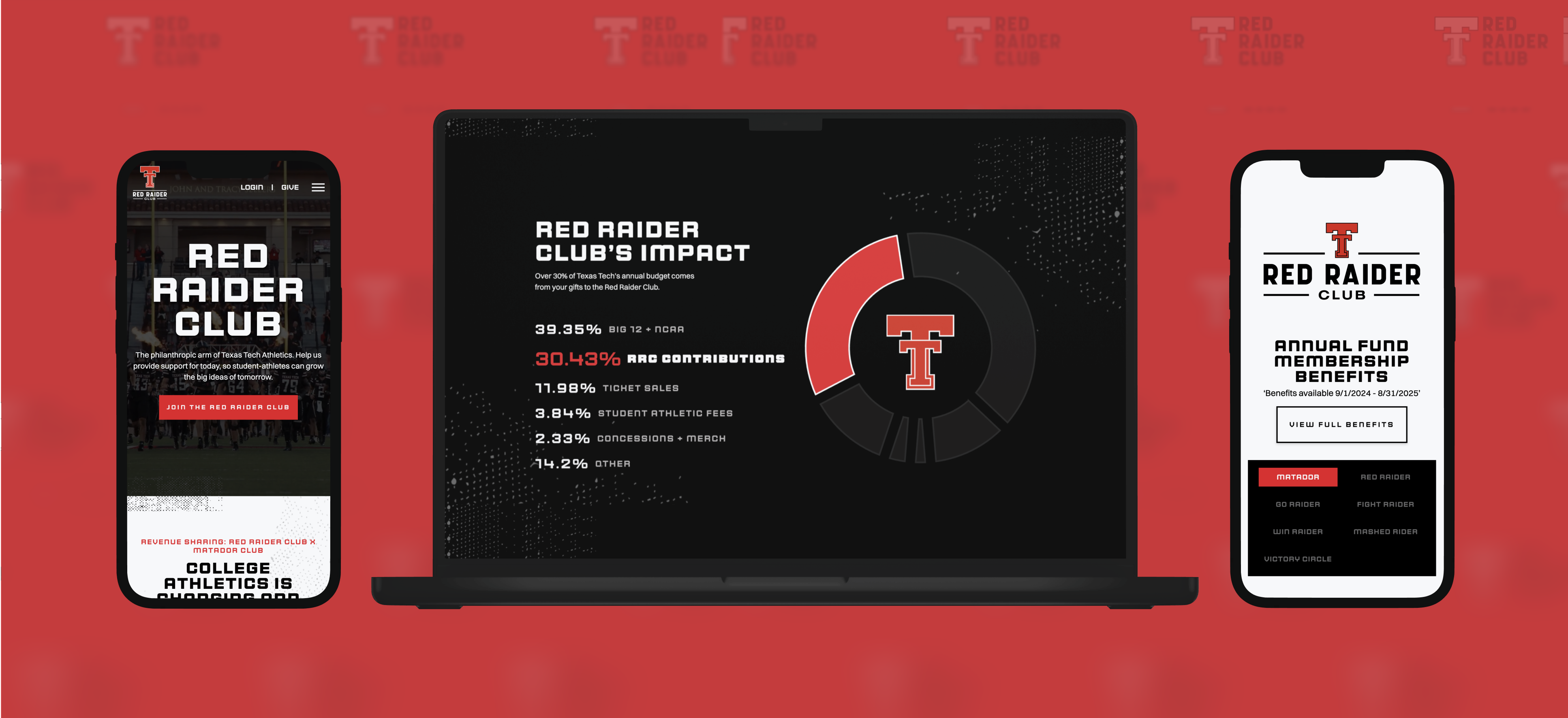
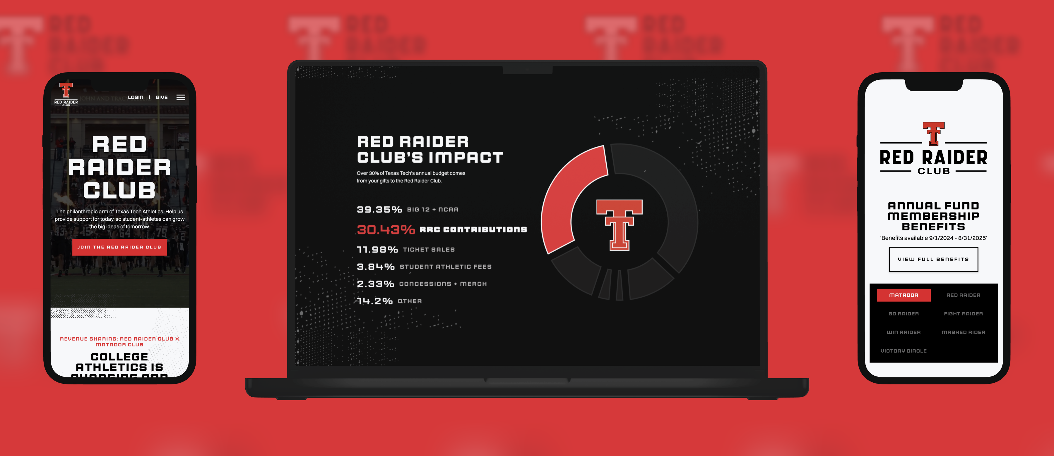
The redesign reenergizes the Red Raider Club with modern, confident branding and clearer messaging.
The new site sparks pride, momentum, and stronger connections between the Club, donors, and fans.
The redesign educates donors on the NIL landscape and the Club’s partnership with the Matador Club, while also attracting new supporters, re-engaging past ones, and strengthening community through clarity and transparency.
The Red Raider Club is the philanthropic arm of Texas Tech Athletics, dedicated to supporting over 400 student-athletes through scholarships, facilities, and comprehensive development programs.
Enhancing donor experiences through exclusive events, digital memberships, and community outreach, strengthening the bond between fans and the athletic program.
Allocating funds to provide financial support and academic services, fostering student-athletes' success in their studies and sports.
Investing in state-of-the-art facilities and programs that promote physical, mental, and nutritional well-being.
Partnering with the Matador Club, the Red Raider Club facilitates fundraising for NIL opportunities, ensuring competitive compensation for student-athletes.
As the face of college sports changes, Red Raider Club is evolving alongside it. The group seeks to update their brand to capture the excitement of a new RRC, and to balance where we have been with where we are headed.
Following the establishment of a new logo and brand, the Red Raider Club site will be redesigned.
In early discovery, much of the conversation centered on balancing the Red Raider Club's deep history and forward momentum. As an organization rooted in decades of tradition and now evolving through NIL and its merger with the Matador Club, the brand needed to honor where it’s been while embracing where it’s headed.
IT made sense to use the “retro” flat Double T paired with a clean, modern typeface, to strike a balance between:
"heritage and progress, legacy and innovation."
The updated logo takes a simple, timeless approach, refined and rooted in tradition.
The flat Double T and clean, bold typography create a look that’s confident, modern, and versatile. It honors the Red Raider Club’s legacy while staying adaptable across merchandise, fundraising, and digital platforms.
The logo system was built for flexibility, with multiple layouts and variations designed to suit a wide range of use cases. For example, it can even be put onto a crane (see below).
Whether the logo is used on merchandise, digital platforms, signage, or donor materials, each version maintains visual consistency while giving the Red Raider Club the freedom of use.
These are the key foundations that drove the new visual design, content strategy, and information architecture.

Engagement is one of RRC's primary organizational goals. To this end, our team redesigned the new experience to be both engaging in it's own right, and to inspire action.
This was achieved through a bold design, motivating copy, energetic photography, and use of video that showcases "being part of a winning team".
Involvement is another key goal in terms of attracting new donors are retaining existing ones. Involvement comes through a sense of belonging and a shared sense of duty or action.
Our goal was to encourage greater involvement by making the Red Raider Club feel more open, approachable, connected, and purposeful.
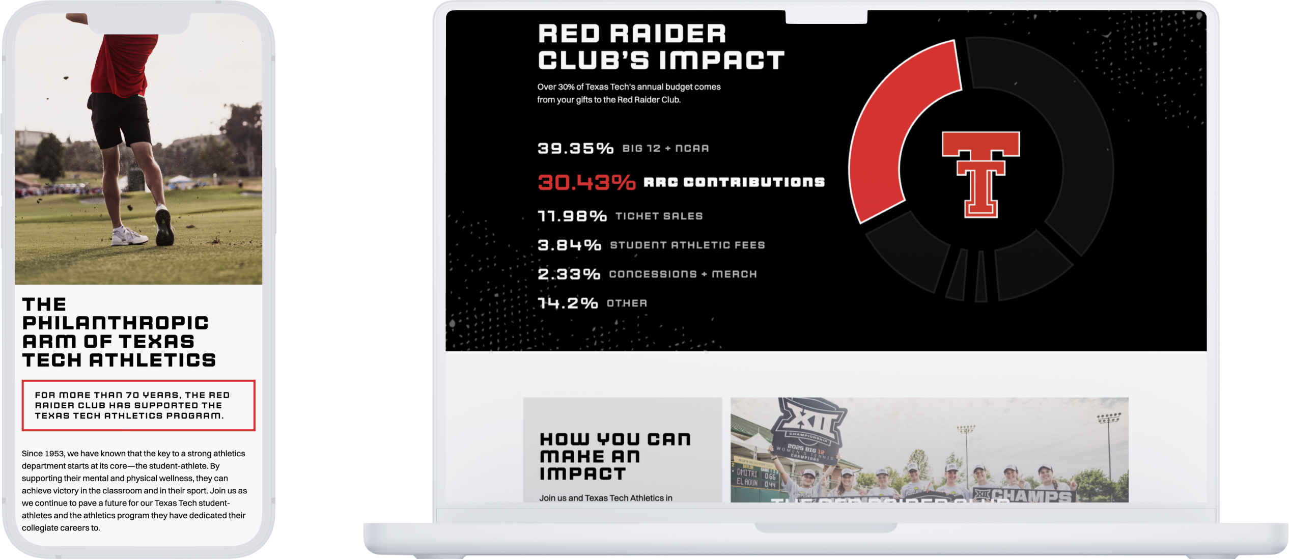
The redesign supports clarity on how donor support works, educating members on the NIL landscape and the Club’s partnership with the Matador Club to show exactly where contributions go and how they benefit student-athletes.
There is also education around who RRC is, what you get by joining, and how your donations impact Texas Tech Athletics.
All of these key drivers feed into the most important one, impact. We sought to design for impact by bringing a modern design with energetic, impactful visuals that inspire action.
Through effective design and messaging that focuses on impact for the individual, RRC, and Texas Tech, the new Red Raider Club website builds a stronger sense of community through clear calls to action and inspiring content.