.png)
Design direction
Creative concepting
Brand strategy
Print design
Design Director (me)
Design Lead
Senior Designer
Senior Copywriter
Client Strategist
Project Manager
Visit Lubbock works to attract and support tourism, conventions, meetings, and event travel to the city. Their efforts include marketing Lubbock’s hospitality and cultural offerings, helping plan and host meetings and events, securing room blocks and venues, and ensuring visitors have positive and memorable experiences.
Since 2004, they’ve booked thousands of events, generated nearly 3 million visitors, and driven hundreds of millions in economic impact for the region.
Visit Lubbock seeks to support and enhance tourism to the region by showcasing a modern Lubbock and what it has to offer for visitors.
by converting more website visitors into trip planners and travelers.
position the city as vibrant, modern, and welcoming through strong storytelling and visuals.
(conventions, meetings, group travel) through improved resources and contact pathways.
with intuitive navigation, filters, and itineraries that help users quickly find things to do, places to stay, and events.
of hidden local gems, events, and attractions.
and accessibility across all devices and browsers.
What are the key factors in the market and with the current site that will drive our descision making?
Many destination sites feel generic and interchangeable, lacking authentic local character.
User expectation is growing for tools like interactive maps and itinerary builders.
Tourism sites often don’t connect culture, people, and experiences in a compelling way.
Falls short in capturing a modern and exciting identity. Generic stock imagery and an inconsistent design and tone that doesn’t reflect brand.
Unclear next steps (“Plan your trip,” “Book now,” etc.). Poor conversion flow between inspiration, planning, to booking.
Hard to find basic info due to a large number of pages and content. Overloaded menus and buried content.

Overall, the new visual design stands out in the space by taking a modern and creative approach not commonly seen in tourism. This approach highlights the unique culture of Lubbock, and balances both what the city is, and aspires to be.
Rework the overall structure of the site to simplify the high-level organization and subsequent high number of pages.
Rework and reduce the listings on the site to be easier to navigate, including filtering and categories to browse by.
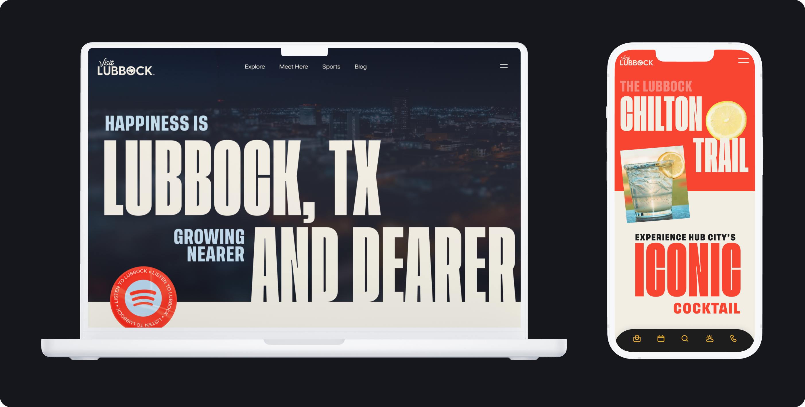
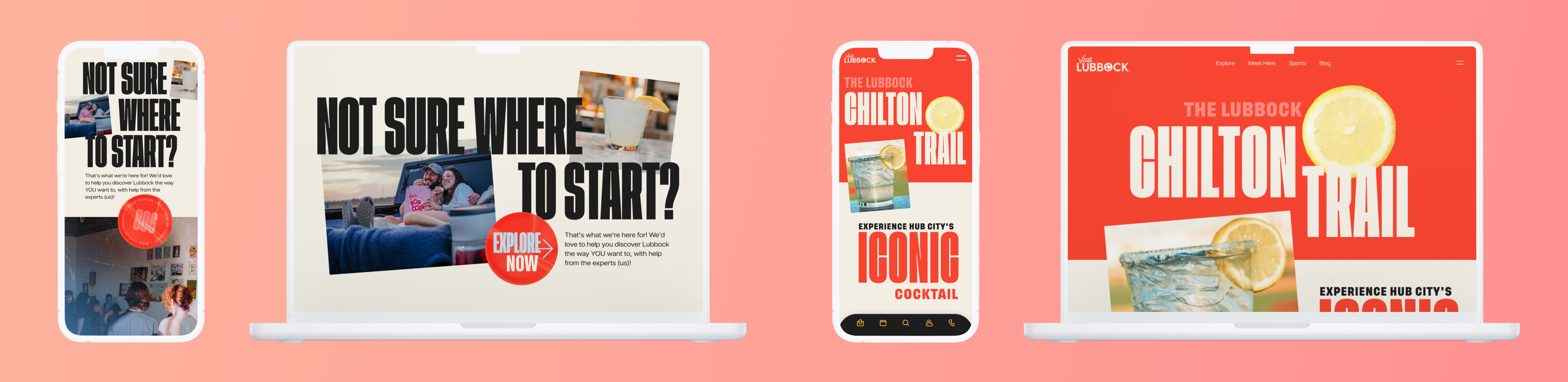
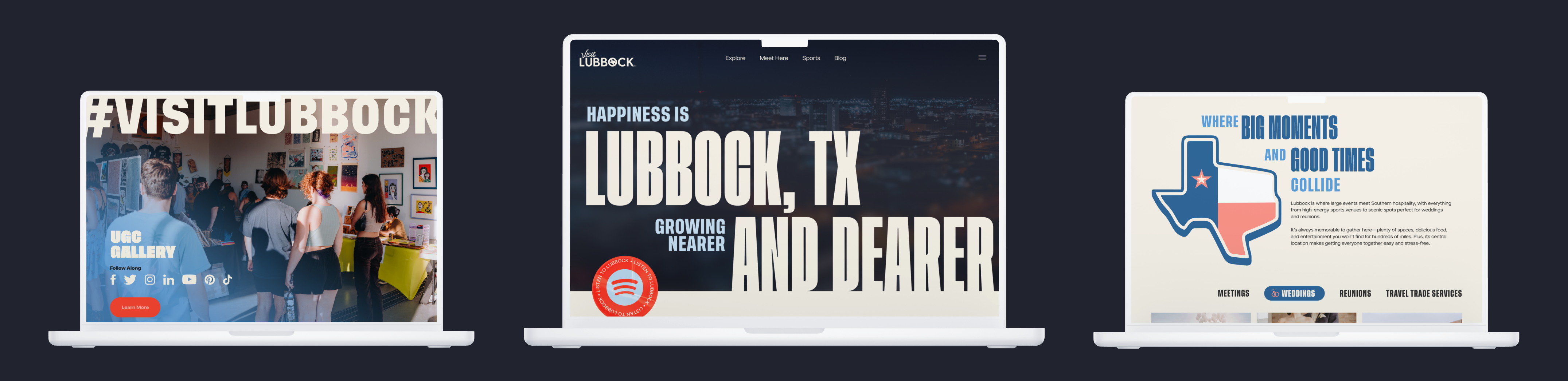
Large, energetic, and bold typography and colors to capture a modern brand identity.
User expectation is growing for tools like interactive maps and itinerary builders.
Many destination sites feel generic and interchangeable, lacking authentic local character.
In this phase, we began by researching how travelers discover, plan, and experience the destination. Through market research, journey mapping, mapping the flows, and wireframing, we moved from ideation to build.

We then mapped the end-to-end user journey, visualizing each stage from initial inspiration to trip planning and sharing experiences afterward. This revealed pain points like confusing navigation and gaps between discovery and booking.

We then mapped the end-to-end user journey, visualizing each stage from initial inspiration to trip planning and sharing experiences afterward. This revealed pain points like confusing navigation and gaps between discovery and booking.
Using these insights, we moved into ideation, brainstorming ways to simplify planning and make the site more inspiring and actionable. The strongest ideas were translated into user flows, outlining how visitors would complete core tasks such as finding attractions or building itineraries.
Following establishing the new site structure and flows, we moved onto high-fidelity design. These were our main foundations of focus:
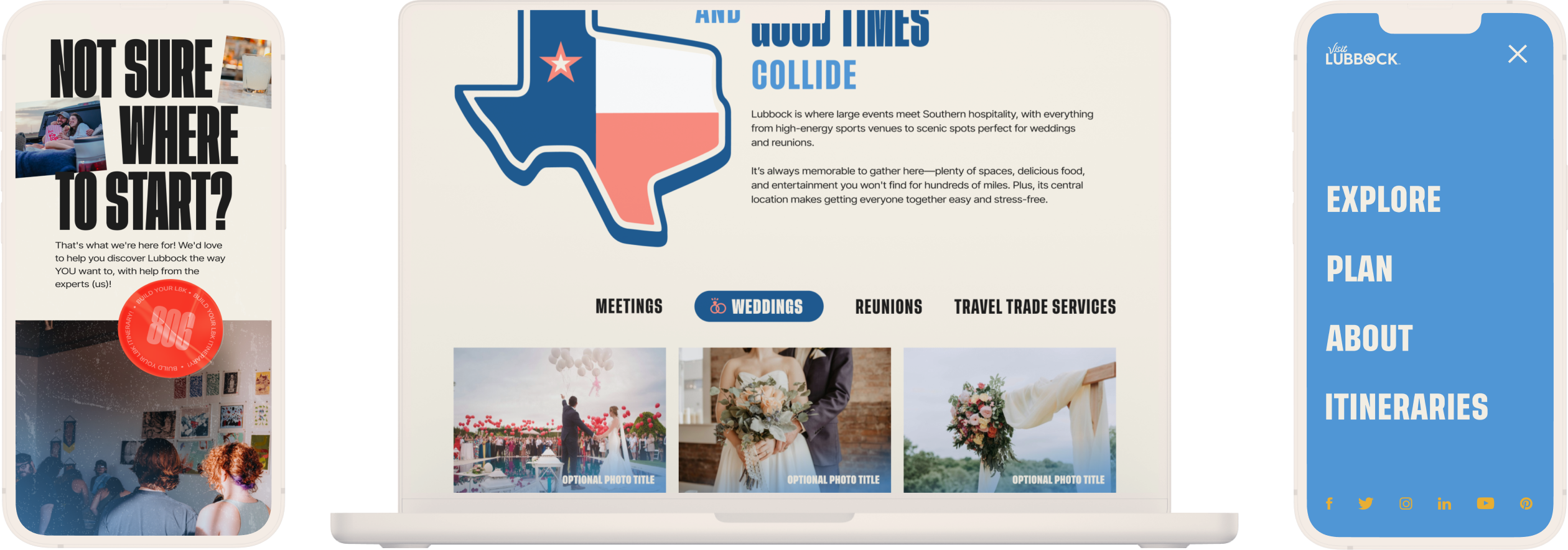
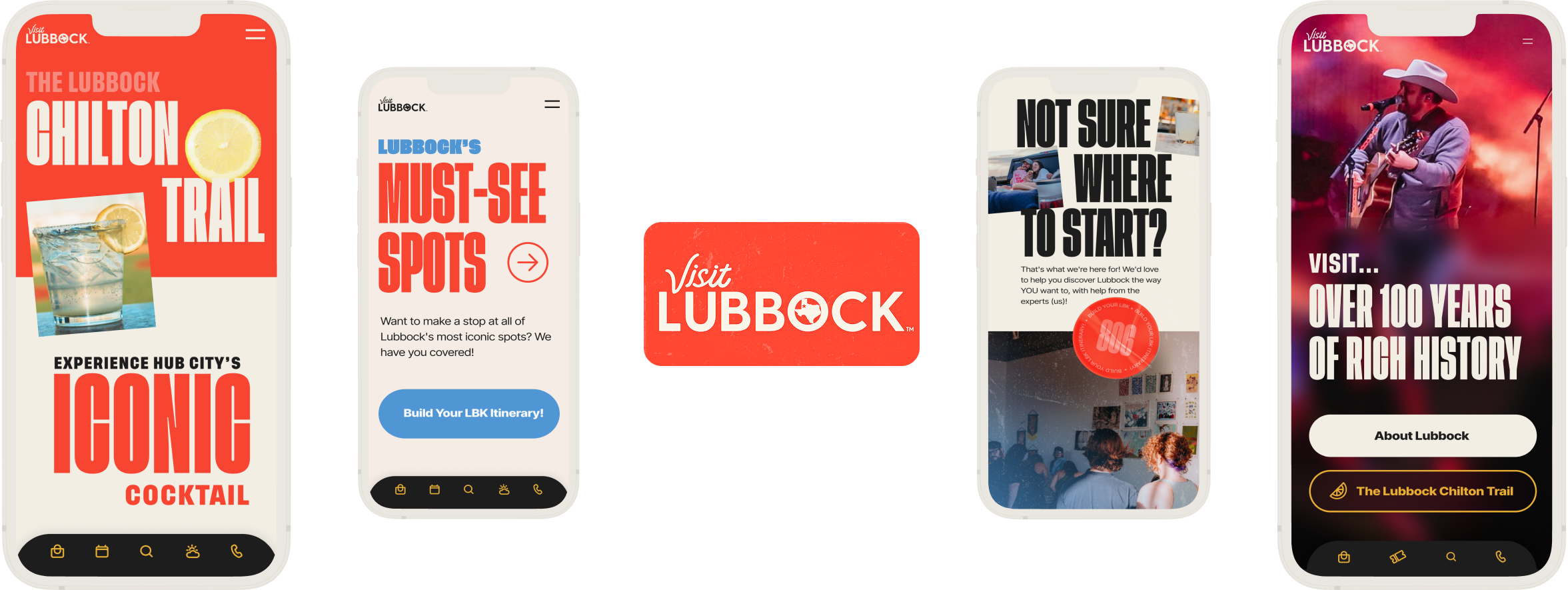
The structure and content strategy focused on creating a more action-oriented experience for visitors of Lubbock. Navigation was restructured around key user goals, what people come to do, see, or plan, making it easier to take action and find relevant information quickly.
Content was reorganized to improve discoverability, especially within listings, which were redesigned using a tiered content strategy that prioritized hierarchy and prgressive disclosure.
This is where the brand became central. The goal was to break from the typical tourism aesthetic and create something bold, energetic, and distinctly Lubbock.
What we ended up with was a design that reflects the city’s character, heritage, and forward momentum. Through a bolor color palette and typography, the new design seeks to capture both what Lubbock is today and what it aspires to become.
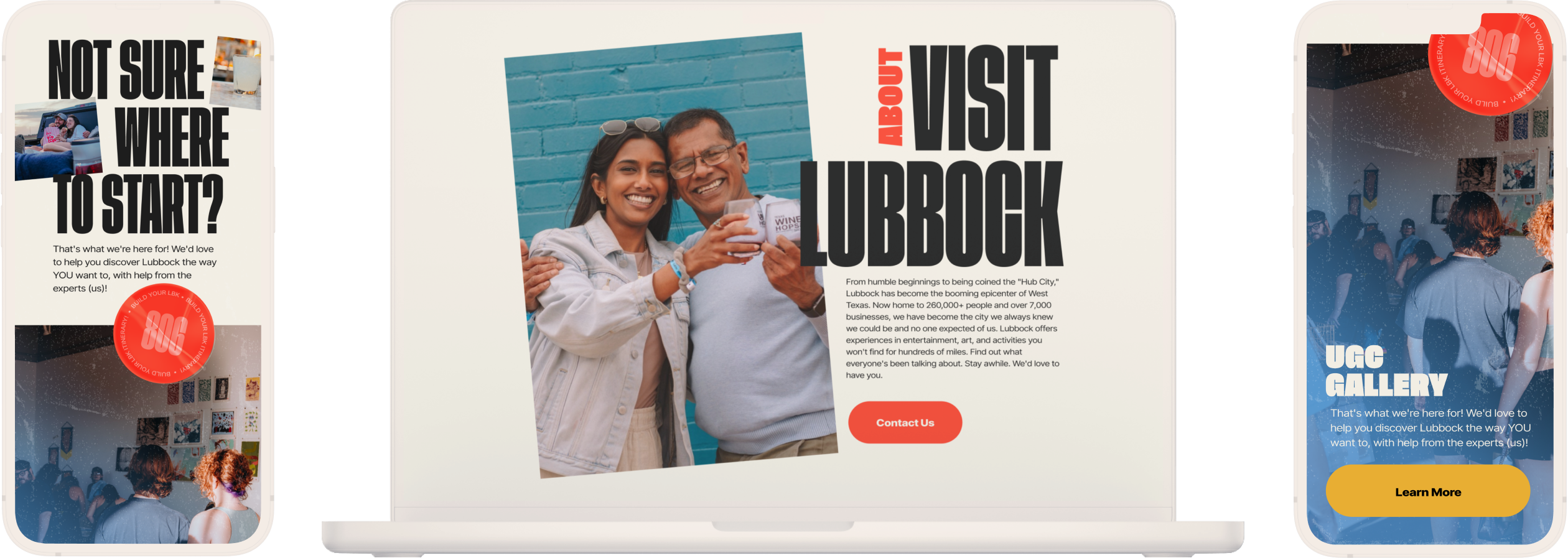
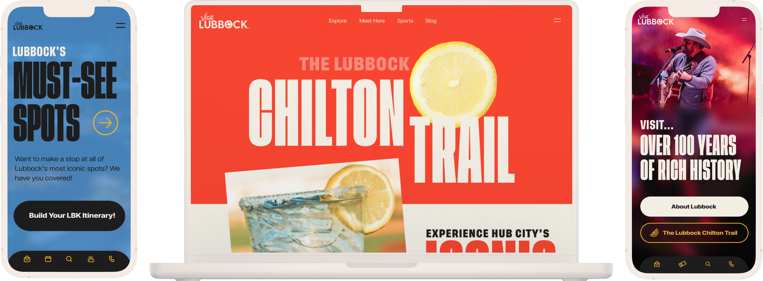
We utilized authentic, custom photography and video to create a genuine look and feel, moving away from the generic, stock imagery common across other tourism sites.
This approach brought real people, places, and experiences to the forefront, giving the brand a more personal and distinctive visual identity.
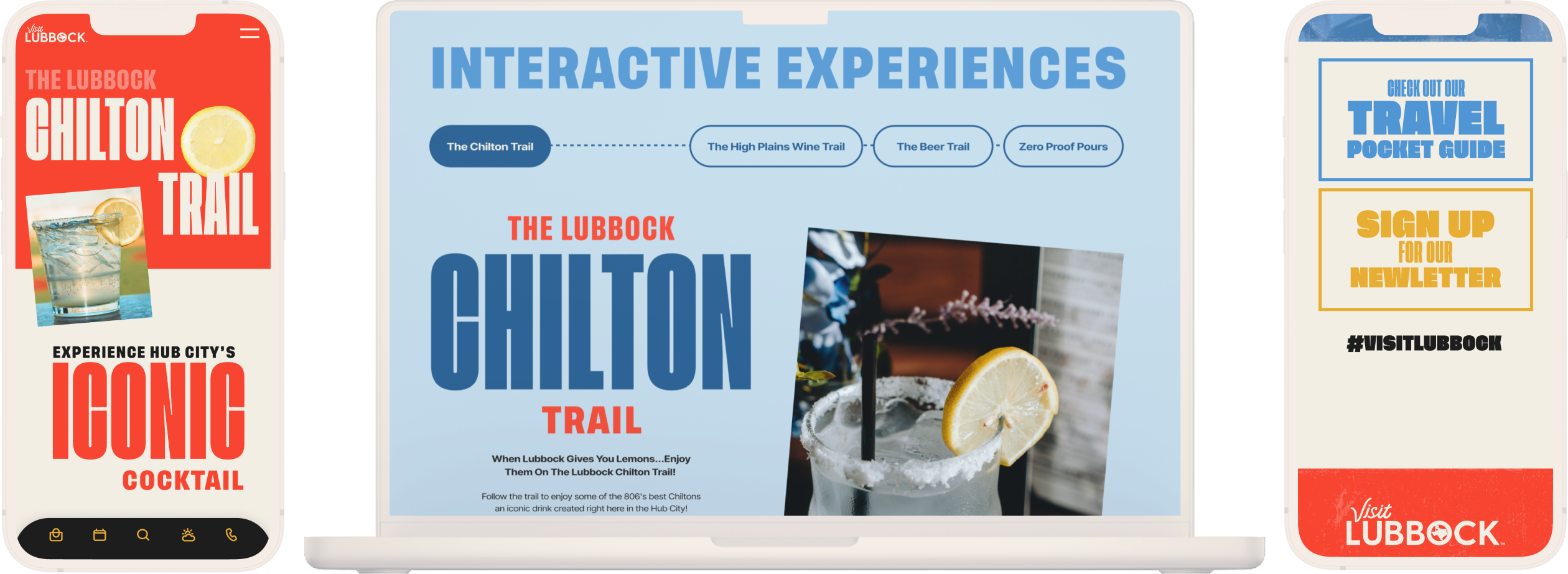
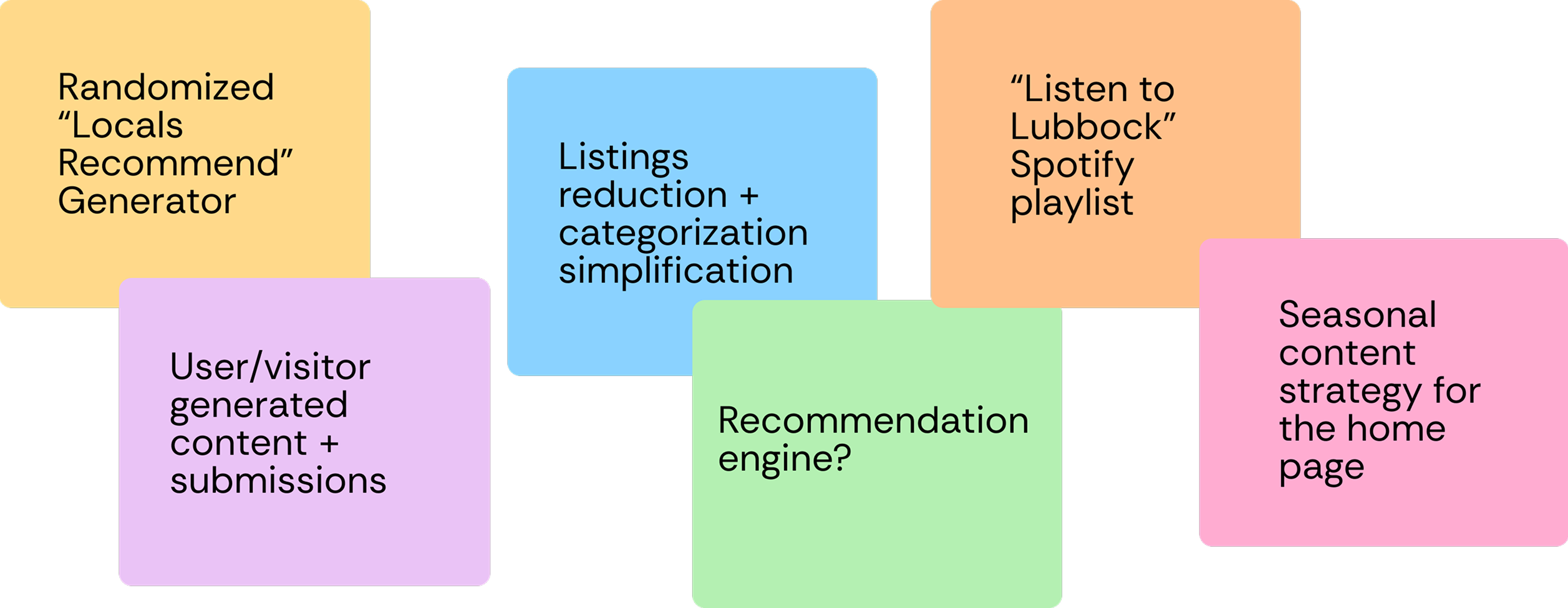
We incorporated interactive tools and experiences to make trip planning more engaging and personalized.
This included features like travel pocket guides, trip builders, personalized planners, and local recommendations for stays and eats.
The launch of the new Visit Lubbock website marked a significant milestone in redefining how the city presents itself to visitors. The redesign established a distinct, modern brand identity that captured Lubbock’s evolving story, one that the Chamber of Commerce sought to share with both locals and visitors.
Beyond its visual transformation, the site became more action-oriented, making it easier for visitors to discover attractions, plan trips, and connect with local experiences that reflect the spirit of a more modern Lubbock, Texas.
Within the first weeks of launch, the new site saw a 12% increase in traffic, reflecting strong engagement and interest in the refreshed look.
Established a bold, energetic identity that differentiates Visit Lubbock from other tourism destinations.
Streamlined information architecture and clearer navigation helped users find what they are and discover content more easily.
The launch drove a 12% spike in website traffic and greater interaction with new content and tools.